An Ivanhoe Design Idea
So last week Francesca and I each pitched design for our informational website. While the bulk of our pitches focused on the look of the website, I formulated my website design (ps, as this was just a mock up it isn’t cross browser tested, sorry) to be as transferable as possible (or desired). Had we gone this direction, certain elements of my design–colors, font, iconography–could have been exported to the finished game so as to give an aesthetic continuity to the entire project. Whether or not this is a good idea–i.e. using the aesthetics of the finished game to make an active and explicit intervention into the game itself–is a topic we are still working through (more anon). In the end, we went more Francesca’s way than mine–for reasons that may become clear below and in consultation with her post on the design pitches–but the exercise in coming up with a design was generative and opened up new ways to think about the game. Below is a verbatim copy of my rough pitch. Please pardon spelling , grammar, gross generalizations, etc. I will say that the major strength of my design was also its weakness. We all thought (myself included) that it overdetermined the nature and use of the game and might discourage potential (non medieval [well what did you expect?]) users.
- Summary
My design consists of three major elements: a color scheme, a set of three icons, and a specific font used for all text. These design elements, which will be discussed briefly below, all derive from medieval traditions of book making and reading. I turned to medieval book history for inspiration for two major reasons. First, the name Ivanhoe has an inevitably medieval hue to it. Even if people don’t know the novel, it just sounds medieval. As such, a design that embraced the reception of Ivanhoe grew naturally out of my desire to embrace the history of Ivanhoe in my design. Furthermore, the production of meaning in a manuscript culture—in which books were visual and oral as well as textual—has remained in my mind as we have developed the game. Their method of iteration, bespoke copying, requires close engagement with and modulation of meaning by individuals and groups endemic to my Ivanhoe experience.
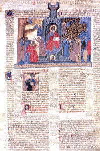
- Consider an opening from a copy of Gatian’s Decretals:
Bologna, s. xiii Cesena, Biblioteca Malatestiana, Pluteo II sin. cod. 1, fol. 2r
The commentary wraps the text, which is in turn illuminated by an illustration depicting oral composition. If they could have put in movies and music, they would have!
- Color Scheme
From this tradition I gleaned a color scheme that both harkens back to medieval books, but more importantly, reflects their hard-earned insights into how to make messy text legible and navigable. Light-grey text contrasts with a light-cream writing support, and muted reds and blues highlight and punctuate the text.
- Iconography
-The pilcrow ¶ (modern sign for paragraph ) evolved out of capitula, or chapter markings, and was used to signify a new train of thought. Throughout my design pilcrows mark out trains of thought regarding our Ivanhoe narrative. What is the game. Where did come from. Why. These sorts of things.
-The hedra ❦ is perhaps the oldest form of punctuation and has been used to mark off major sections of texts up to present times. In my system hedras signal moments of transfer in which information is being passed between users. In our website this is the “Install” section. The leafy, organic, vine implies notions of planting, growing, and connectivity while at the same time marking discreet units.
-The manicule, ☝ or pointing hand, is a frequent marginal notation deployed by readers to simply say “look here” “important.” I deploy the manicule for similar functions on the website. It points to documentation and demos. Places we want users to LOOK.
- Font Choice
I make exclusive use of Caudex through out my design. I choose Caudex for three reasons: style, legibility, and versatility. In style it echo aspects of various Gothic bookhands, but, crucially it remains legible in both is minuscule and majuscule forms. This dual legibility allows me to deploy majuscule scripts for logos and headers but use the miniscule for content. Thus my logos, rubrication, and content maintain a basic continuity.
- Applicability for the Game
While I formulated my design identity around the info website, I believe its major elements could translate to gameplay with minimal difficulty. The icons were chosen in part for their symbolic valence, but also for their general utility as bullet points, section markers, and possible buttons in the game. All are text ornaments and not images thus they are easier to work with. The basic color scheme is minimal but useful (light grey for most text, red to flag attention, blue to ornament) and the merits of the font discussed above apply to the game as well. Thus I believe this identity allows for a strong aesthetic sense of what our game is that both relates to the history of Ivanhoe and to possible future experiences of it. While the manuscript book might seem over determined, the Book was and remains the western icon for information transfer and the dynamic tension produced by echoing medieval practice in a post-modern digital environment might produce interesting result.

