CSS Victory!
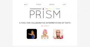
So the other day I spent most of my day working through the CSS on the Prism site. It was incredibly annoying at first but at some point I really hit my stride and started to get it. In order to start just figuring out where everything was located I made a feature branch (appropriately titled Honey Boo Boo) and started playing around until I could get it close to what I wanted it to look like. I succeeded (as you can see above) in getting the homepage to look like what I imagined. Currently I am using three of my femme superheroes as placeholders for the buttons (for those of you who don’t know they are [from left to right] Honey Boo Boo, Nicki Minaj, and RuPaul). So this is a rough sketch of what the homepage might look like, although we will probably tone down the fabulosity that is the current buttons. Thoughts? Feedback?

