Faulty Format or User Error?
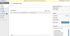
As you’ve already learned from Stephanie’s post team delegates (Stephanie & Eliza) have been wireframing ideas for Ivanhoe since we’ve decided on creating a plugin for WordPress. But before this happened, the entire team brainstormed the features that we would like to see included in our final product. As we became animated about our “must haves” (uploading visuals, URL linking, text options) - Bethany brought up a good point - WordPress already does all these things (Plugin not required!) Her statement got me thinking - for all of our desires to create “visual connections” - none of us do this! Perhaps some of the problem comes with the way WordPress is set up - for those of us who rarely notice here is a screen shot (click to make it larger):
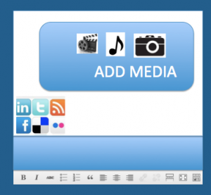
Perhaps part of the reason people don’t link or use media is that the primary space is geared toward writing. Even the symbols most prominent mimic those found on Word (a text-based tool). Think about how different it would be when you clicked on the button to create a new post, this is what came up (yes, it’s a bit ugly…but go with me here)
While these are essentially the same features that already exist in basic WordPress the emphasis on the visual makes it seem like something else entirely (a point McLuhan has been making since the seventies). So what does this mean for us? Well for starts I think we all need to look more carefully at what WordPress already offers and then think about how the organization/visualization of what we create will influence user application in ways we might not intend. Doing so will help us create a product that people want to use but also an environment that fosters our intended ideas.


