Keeping it Real… Clean
Now that we have moved forward with our Rails programming for Prism I have been thinking this week about how our group will collectively decide on an overall aesthetic for Prism. I have been scanning the web and taking screenshots of inspiring designs for a few days as Jeremy suggested, and in the process I noticed very few common principles among them. I collected sites that had elaborate splash pages, some with minimalist styles, a hand-drawn quality, photographic backgrounds, sharp vector graphics, muted palates, and bright primary colors. When I step back and look at what I have collected, it is difficult to come up with a common thread between the pages, much less any sense of my own personal taste. I also tend to browse the web completely differently when I flip the “aesthetic judgment” switch in my head. Content fades away and the pages become more abstract. I expect most of us approached our design research with a number of aesthetic filters in mind to help sift through the mass of possible sources of inspiration, with similar disparate results.
I am thus brought back to an idea that Bethany initially brought up a few weeks ago. I think it would be helpful for us to focus on a few adjectives that we think should inspire Prism’s aesthetics. Design is rarely expressed successfully by using language alone, but we do have a common vocabulary that we can use to filter the myriad of design options for Prism. For instance, I am very interested in preserving a “tangible” quality for our texts in Prism. On the simplest level, using “tangible” as an instigator for design could mean that it is important to keep images of the original text that Prism users will highlight. Taken further, a “tangible” aesthetic might mean an emphasis on simulated three-dimensionality, a “grainy” quality to flat surfaces, or even a reaction against the hard lines of vector graphics.
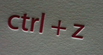
One medium that I believe possesses an inherently “tangible” aesthetic is letterpress. The presence of the large metal printing press seems to hover behind the image of the completed print. This is especially apparent given the current trend to deepen the impression of the plate into the paper.

I am eager to see how prism might embrace the sharp, “intangible” quality of the vectorized highlighters while also emphasizing a mechanized, physical style in the application’s frame, logos and scanned texts.
Another adjective that is often used as a superlative for good design is “clean.” By itself, the adjective is not particularly useful given that it can connote a utilitarian, functional, uncluttered, sharply-defined, clear, high-contrast or even deliberate design. Nonetheless, “clean” is still one of the most common words used to describe web design that “works” and communicates clearly. It is easy to set up “clean” design as an antithesis to more physical, tangible, or “real” imagery, but I hope we are able to avoid this kind of binary distinction. Keeping it real and keeping it clean are not opposing ideas.
