Projection Lessons in Maps
For many years, I have used the following map in my presentations.
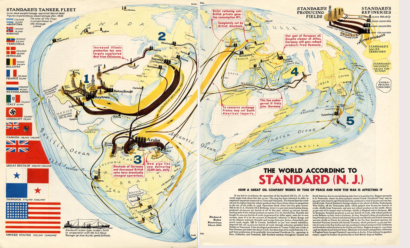
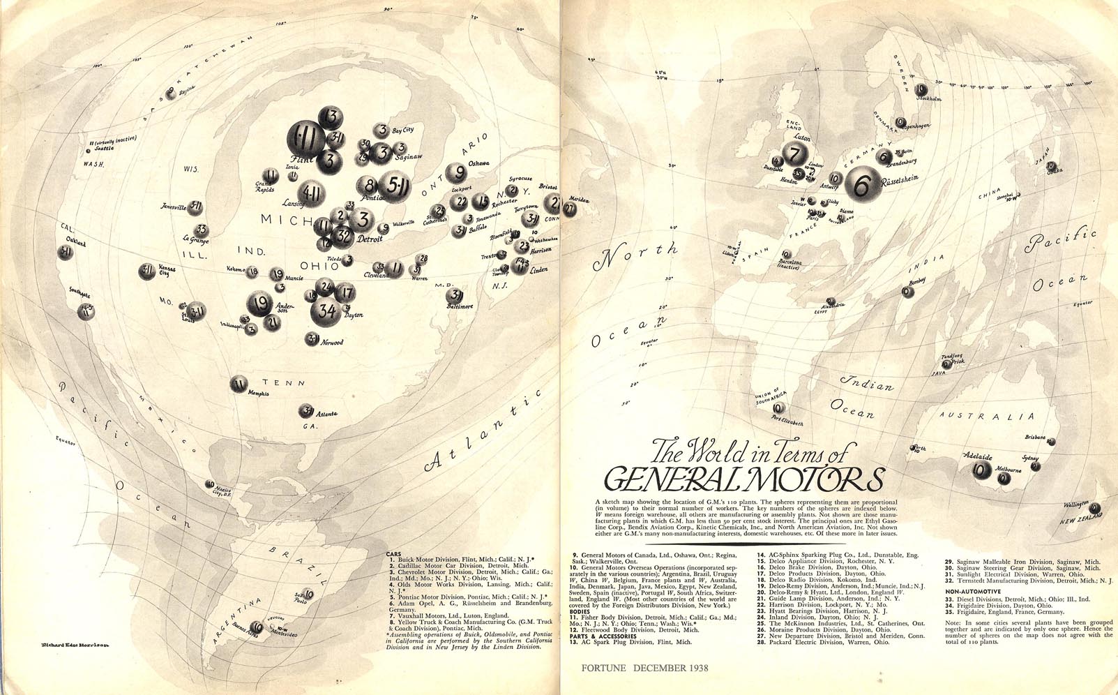
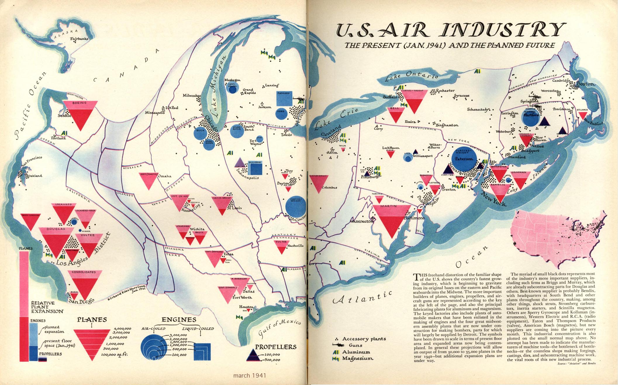
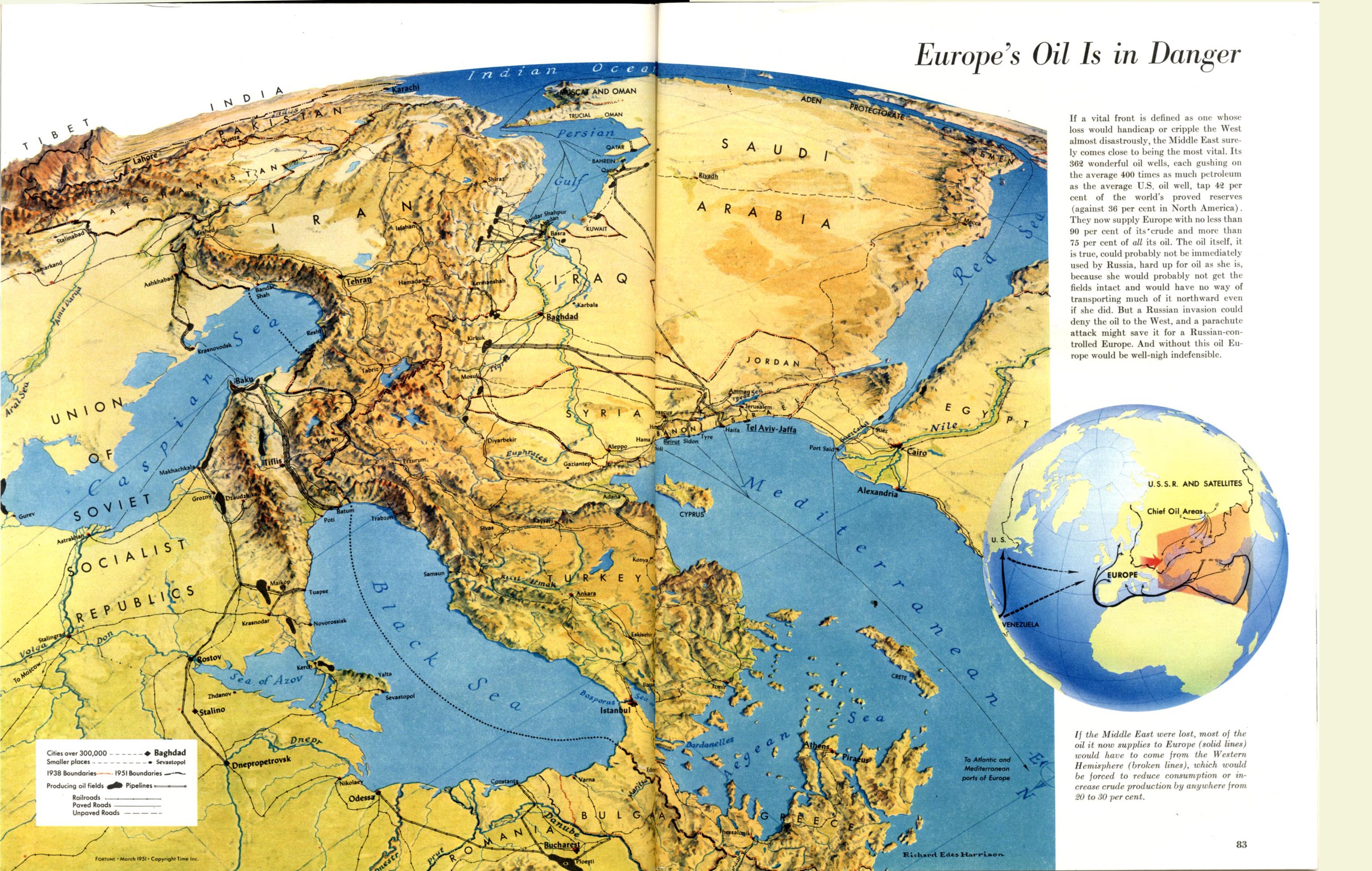
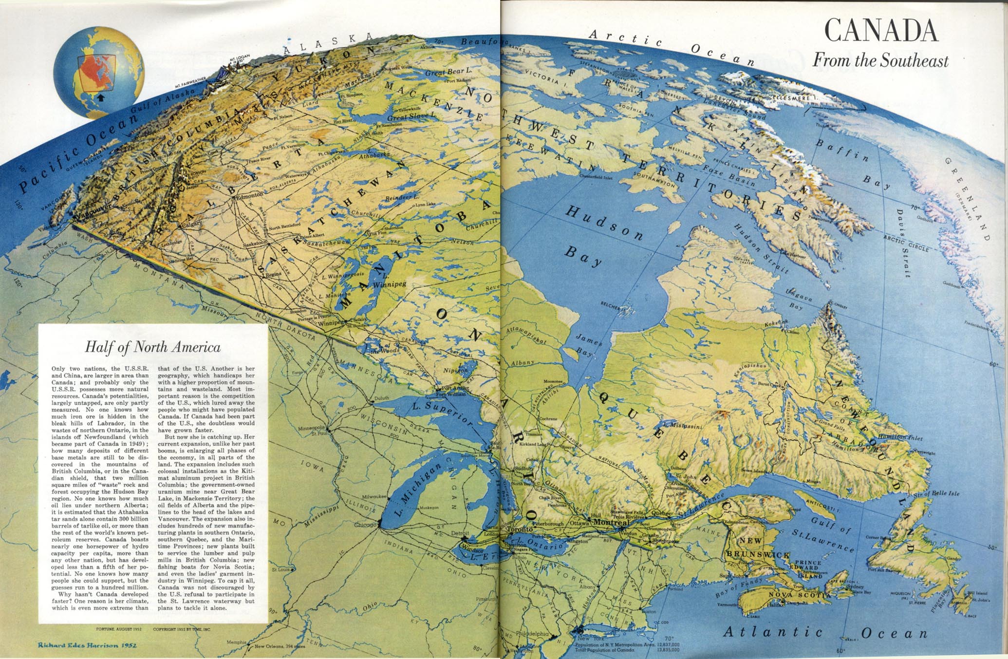
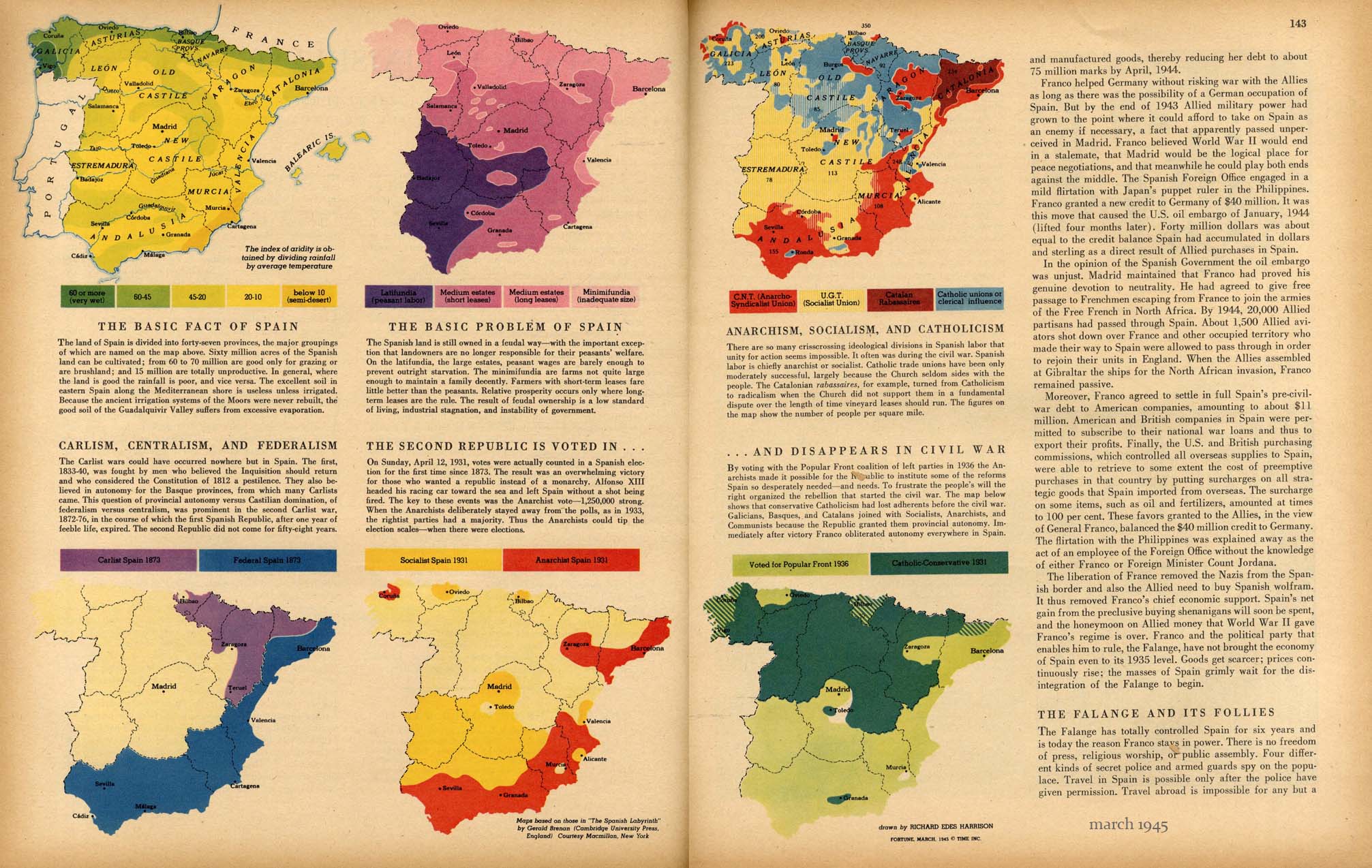
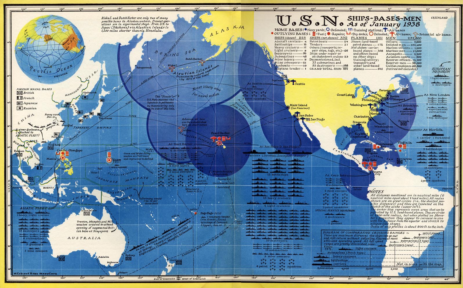
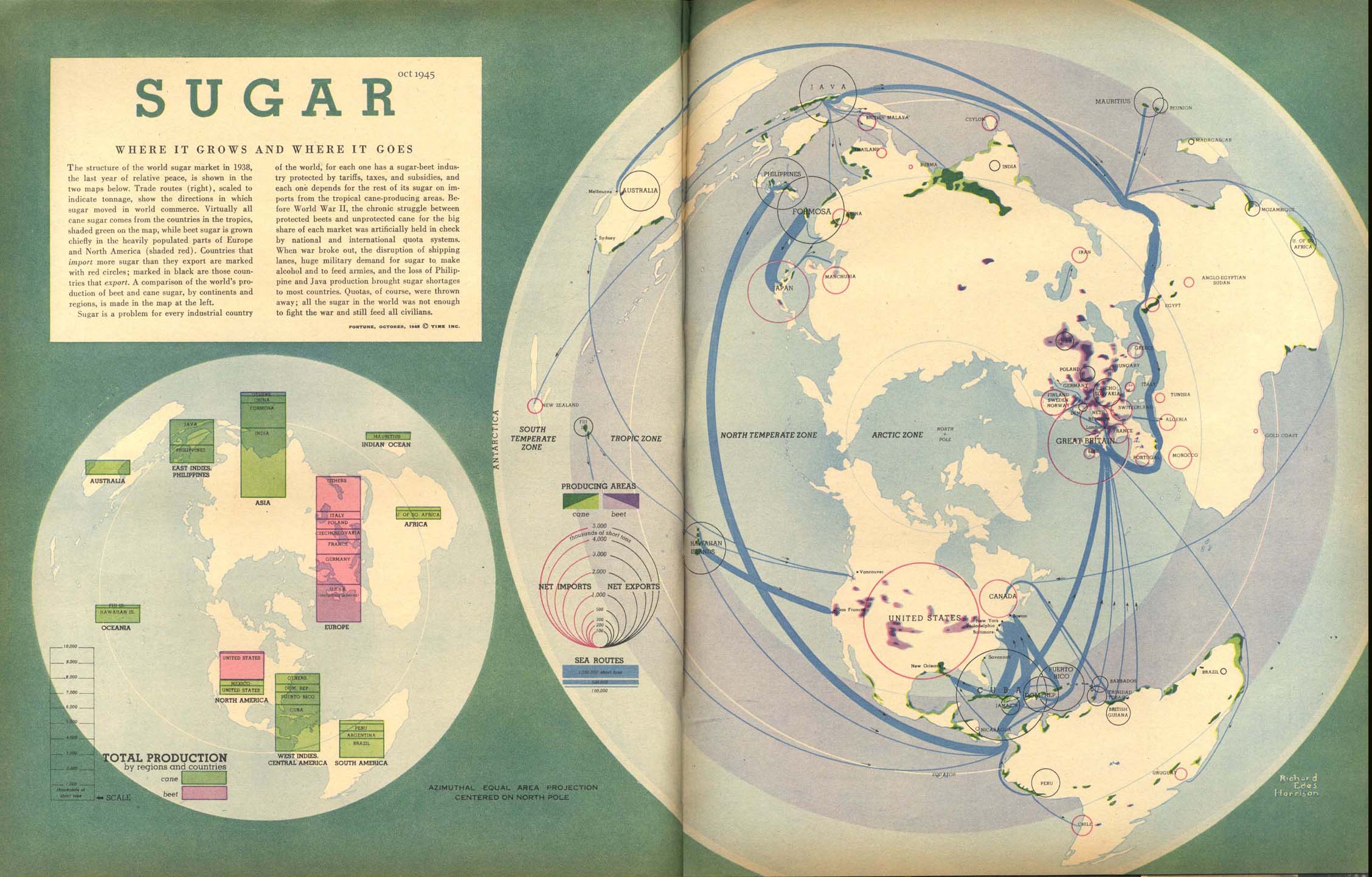
This map is a great example of proportional symbology and is of an interesting subject, especially when juxtaposed with modern oil trading. Of course, the cartographic style is great too. I hadn’t much thought of the cartographer or why the map was created until recently. When I took a closer look, I found the cartographer’s name, Richard Edes Harrison (1901-1994), and that this was one in a series of maps he did for Fortune Magazine mainly in the World War II era. He was a wonderful cartographer and his style intrigues me. There is a large amount of information available about Harrison and his maps.
A website showing some of Harrison’s work: http://www.fulltable.com/vts/f/fortune/reh/mn.htm. (Almost all maps in this post are linked from this site).
An article in Imago Mundi about Harrison’s work: http://www.jstor.org/stable/1151400 (JSTOR access required).
A book showing much of Harrison’s work for Fortune: Look at the World, The Fortune Atlas for World Strategy.
Harrison employed many interesting techniques.
Cartograms
More information on cartograms
Interesting Extent Overviews
Series of Small Multiples
A Tufte favorite. More information on small multiples.
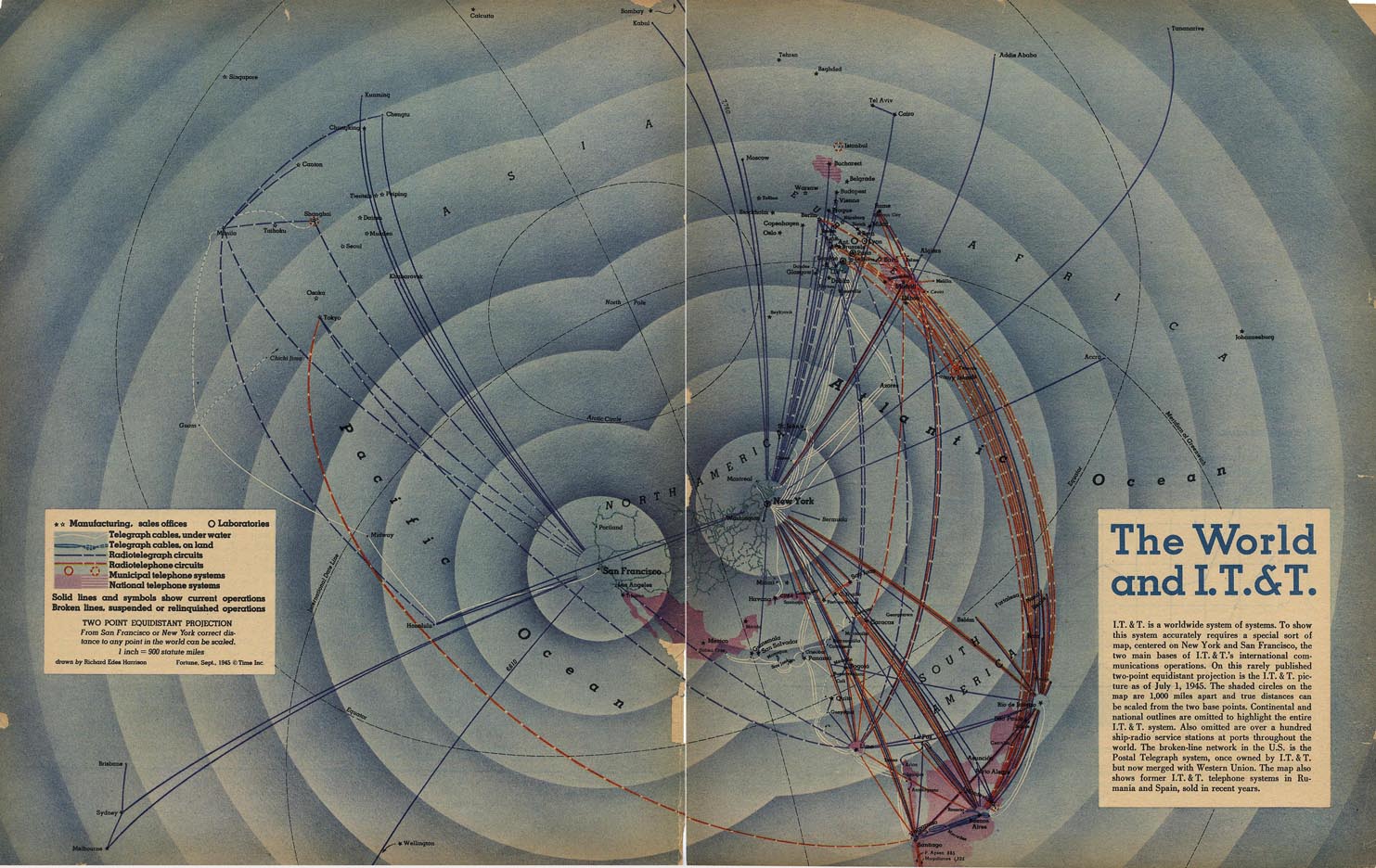
Comprehensive Data Visualizations
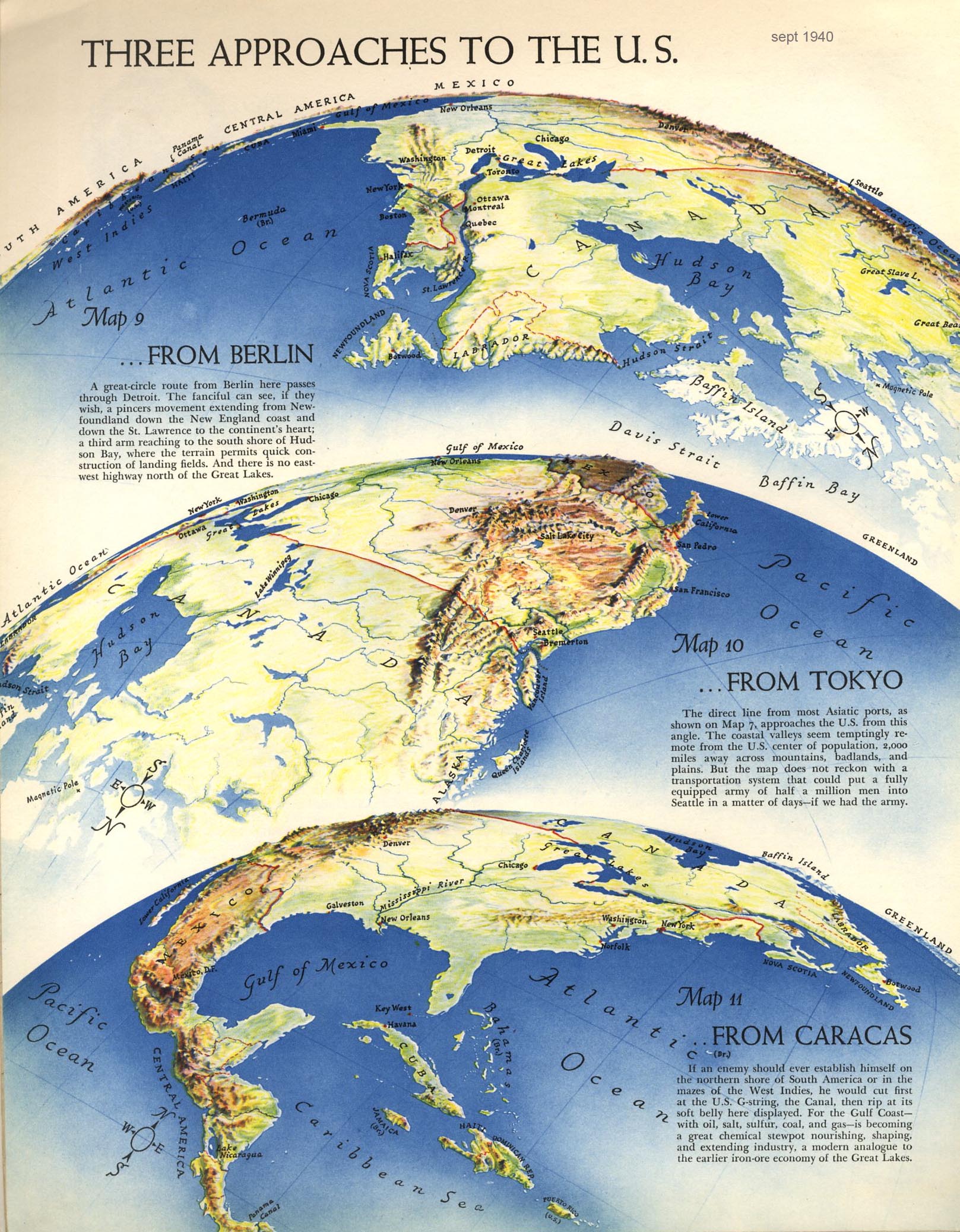
Interesting Projections
More information on projections
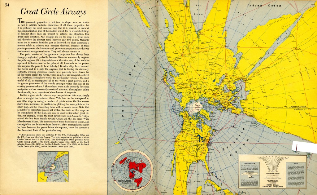
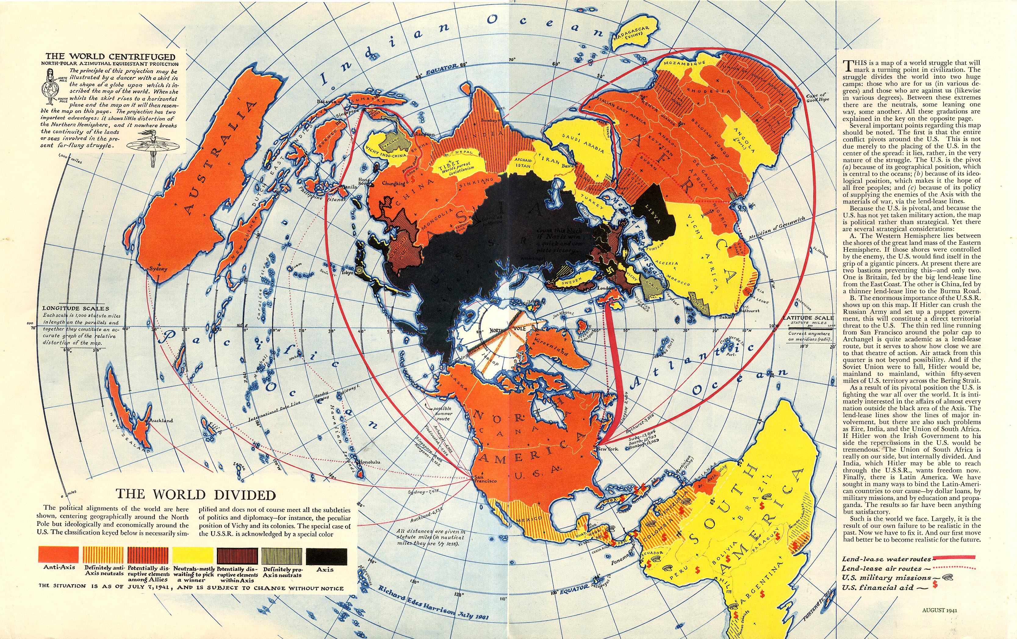
The last two maps have very interesting projection lessons embedded in them.
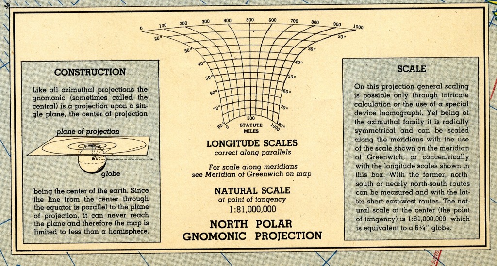
Embedded Projection Descriptions
How nice is that? Having a clear, concise description of projection and scale within the map is a great benefit to the reader.
In this map, Harrison used comparative scales to show changes in distance across map due to projection distortion.
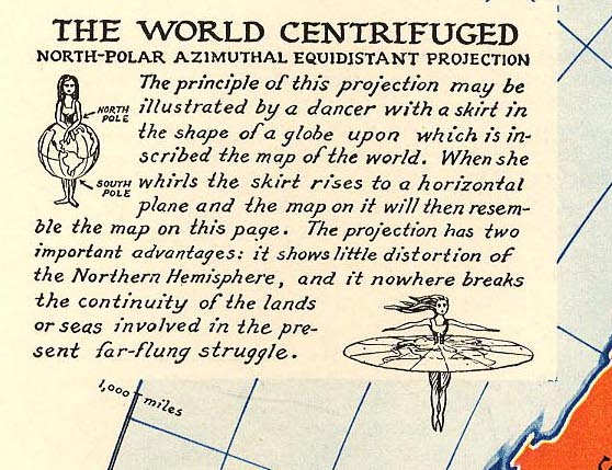
This one is the best. A clear description with a visual that anyone can understand.
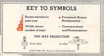
Here is simplified version of the “world centrifuged” in a map called On Assignment.
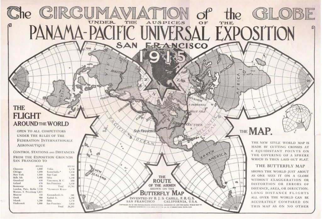
A few weeks ago, I came across the following map.
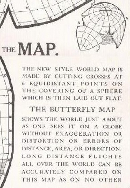
What a beautiful projection! It is know as the butterfly or Cahill projection (Named after the inventor. Cahill even got a patent for a rubber ball that does the same thing.) And as the embedded projection description describes, this is a great map for comparing circumnavigation routes because it does not distort distance, area or direction. Not only that, it gives the “orange peel” figure to further give readers information on how this projection works.
I only learned of the Cahill projection after reading this xkcd cartoon.
Call for Help
If anyone know of other maps with this sort if imaginative visual explanations of projection embedded in maps, please contact me.

