Richmond, Virginia’s Place in GIS and Racial Discrimination History
Richmond, Virginia is a city steeped in history. It is the home of the first commercially viable electric street car system, the world’s only triple train crossing; the first woman-owned and African American-owned bank, and some great Americans including Bojangles Robinson and Arthur Ashe. Not exactly the history you were thinking about, correct? There is much more hidden history in Richmond.
Ian McHarg was born around the industrial town of Glasgow, Scotland in 1920. After World War II, he came to the U.S. and started a career in city planning and landscape architecture. He founded the Department of Landscape Architecture at the University of Pennsylvania and is considered innovative for his notion that design should work with the landscape instead of fighting or changing it. He has also been credited with coming up, in the 1960s, with the idea of map overlay which is a fundamental GIS technique.
So, what do Richmond and McHarg have in common? Before I can tell that story, I have to tell this one. When I was a young struggling grad student, I happened to be at work in the Urban Planning Department at VCU one summer day when a PhD student from the University of California, Santa Barbara – John Cloud – strolled in. He told a small gathering of a few grad students and professors the story of how during the Great Depression the economic conditions were similar to those we face now. There was a foreclosure crisis and banks were not offering mortgages. In an attempt to get the industry back on track, the Federal Housing Administration seeked for ways to estimate neighborhood risk for mortgages. They looked for indicators to predict how neighborhoods would fare at future dates. In partnership with the Richmond Planning Commission (RPC), the FHA used Richmond as one of its major study sites. Mr. Cloud showed us a report he pulled from the National Archives (NARA) called Statistical Data Relative to Housing and other Planning Matters.

December 1935 Version
This report, produced as early as 1935, uses a series of tissue paper overlays to show various themes. A color, loose-leaf card stock map of rent by block is used as the underlay. Mr. Cloud has found this report to be the earliest American example of the use of such overlays during his research. He also found parallel lines of work going on in Germany during the same time period. Please find John Cloud’s detailed article on this story here. There may be older examples out there waiting to be discovered!
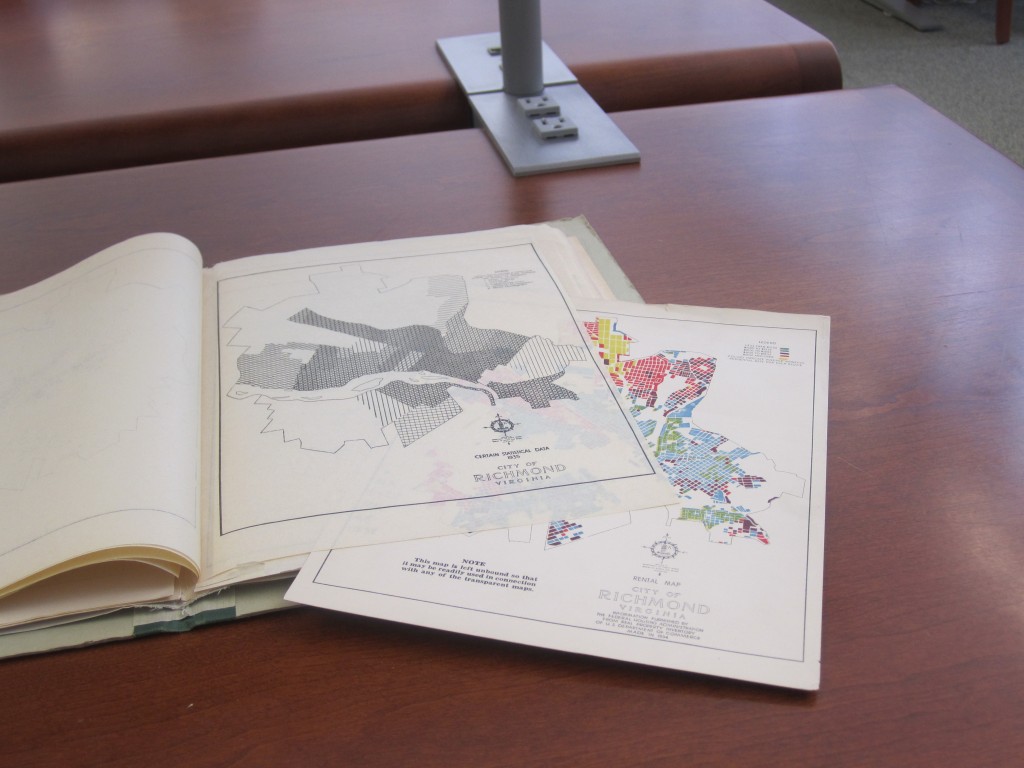
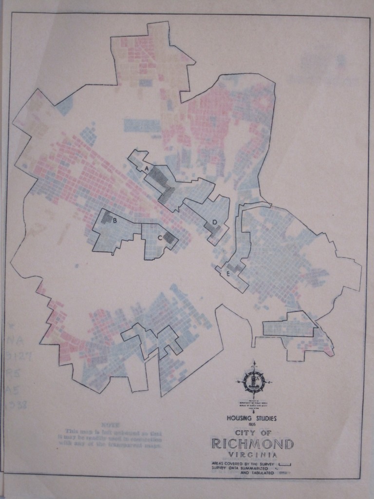
Rental map under housing study area map
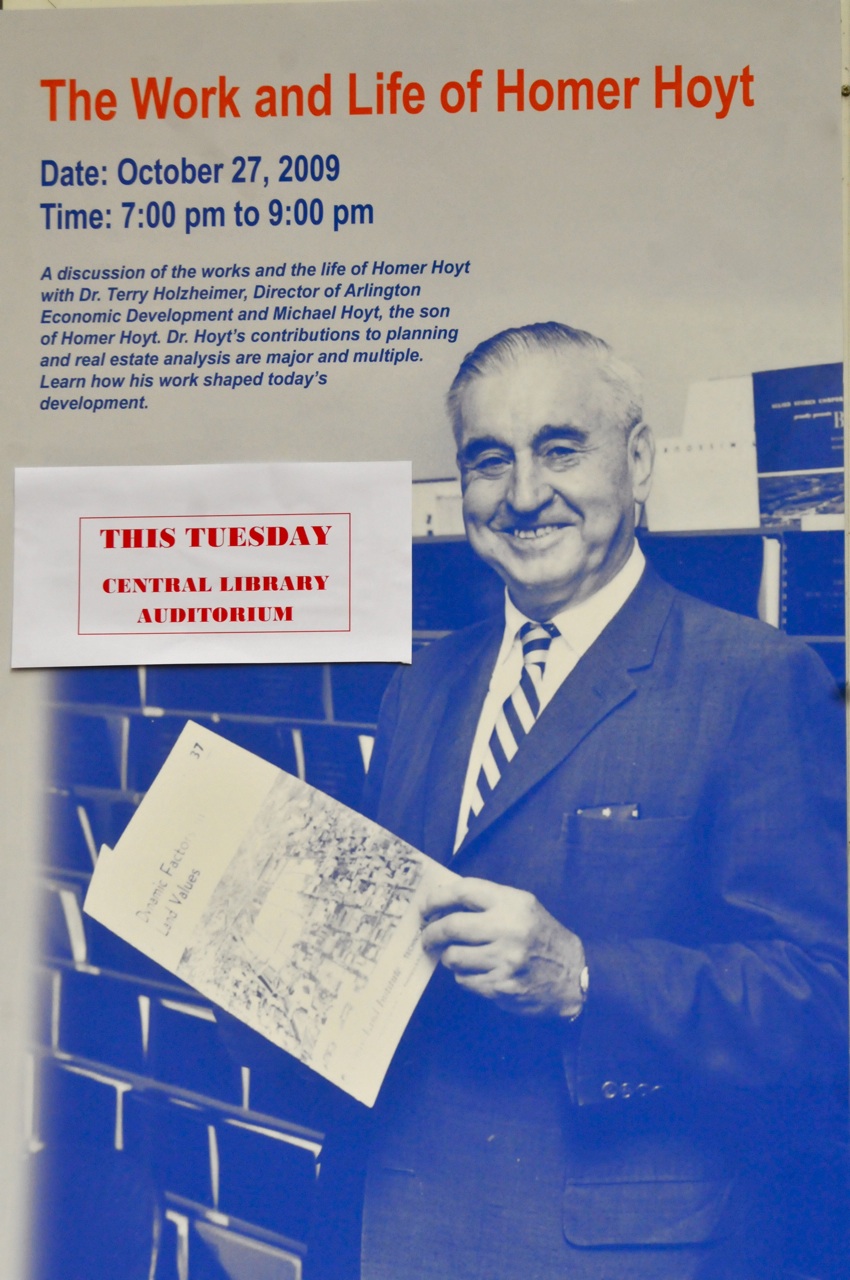
Homer Hoyt
Another player in this drama, economist Homer Hoyt, was an influential researcher at FHA. He wrote a book in 1939 about housing research techniques called The Structure and Growth of Residential Neighborhoods in American Cities.
In that book, Hoyt demonstrated the value of techniques developed during the FHA’s neighborhood forecast research including the sector model and – you guessed it – map overlays. He used mylar sheets in the book to do a series of overlays for Richmond, which is clearly a distilled version of the RPC report maps.
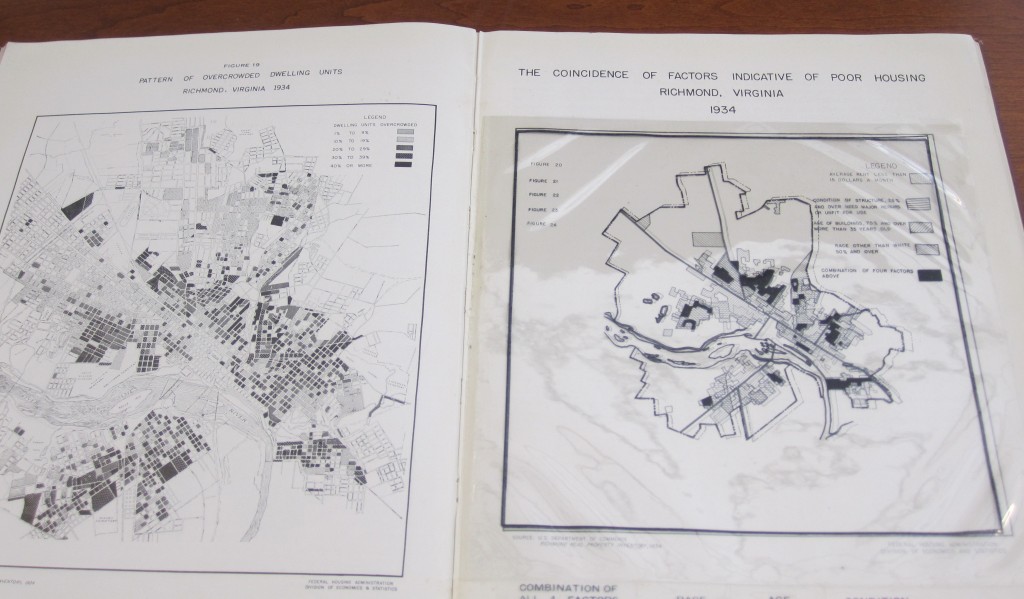
At right, all four of Hoyt’s overlays together: Race, Age, Condition, and Rent
So, it wasn’t really Mr. McHarg who pioneered the use of overlay at all (sorry to all you landscape architects). At least, the RPC, Mr. Hoyt, and German researchers did it some twenty-five years earlier.
On a related topic, in my recent correspondence with Mr. Cloud he informed me that the Library of Virginia (LVA) had another copy of the RPC report that was missing at least one overlay. We agreed that I would scan the LVA’s copy and send him a copy. In return, Mr. Cloud promised to get the missing pages from the NARA copy. However upon further investigation, I have discovered that there are at least two versions of the document. The NARA version is dated December, 1935, and the LVA version is dated January, 1938. There are a few discrepancies between the versions and it is hard to tell whether they were produced with different overlays or whether some layers have been lost over the years. Specifically, there are unique overlays in each document. The following table is an inventory of the overlays for each document.
| Rental Map (by city block - card stock color underlay) | Yes | Yes |
| Rental Map (by area) | No | Yes |
| Relief Cases (point data) | Yes | Yes |
| Juvenile Delinquency (point data) | Yes | Yes |
| Adult Delinquency (point data) | Yes | Yes |
| Infant Mortality (point data) | Yes | Yes |
| Tuberculosis - 1934 (point data) | Yes | Yes |
| Population - 1930 (dot density) | Yes | Yes |
| Areas Inhabited by Negroes (area) | Yes | No |
| Certain Statistical Data - 1935 (combination of TB, relief and delinquency) | No | Yes |
| Principal Thoroughfares | Yes | No |
| Housing Studies (shows specific study areas within report) | Yes | Yes |
| Territorial Growth | Yes | No |
| Census Tracts - 1935 | Yes | Yes |
Mr. Cloud had concluded that purposeful reasons (i.e. a tear out) were to blame for the missing African American overlay from the LVA version of the RPC report. However, based on my comparison of the two different texts, I am not so sure. I believe Mr. Cloud did not have all the information. Did the 1939 version of the report originally have different overlays than the 1935 report? Or were overlays removed/lost from each copy in the subsequent decades? Of course, it wouldn’t be a surprise to find out that someone purposely removed specific overlays from the PRC report given the amount of revisionist history around Richmond.
Hoyt listed four factors (race, age, condition, and rent) in determining neighborhood risk. According to Hoyt’s analysis, we have race, specifically the number of African Americans, as a major indicator for forecasting neighborhood risk. Is that enough to cement Richmond’s place in racial infamy? Not quite. However, much of his research went into a survey which concluded in a series of maps produced by the Home Owners’ Loan Corporation (HOLC). The HOLC maps were used as proof of redlining, as term coined by John McKnight in the late 1960s.
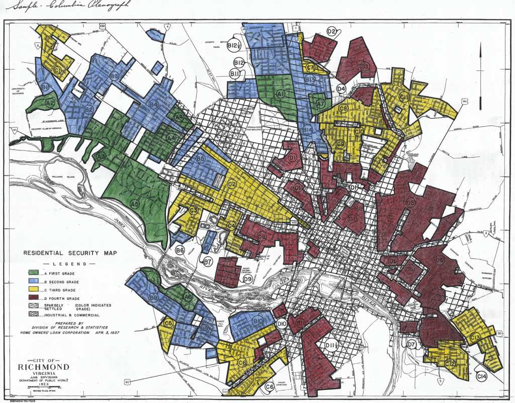
“Redline Map” of Richmond by the Home Owners’ Loan Corporation
Undoubtedly, race – specifically the percentage of African Americans – played a large role in determining the hazard values for the HOLC maps. The question is whether or not the HOLC maps caused institutional discrimination against African Americans after their production. Amy Hillier, a researcher at the University of Pennsylvania, says no, at least not in Philadelphia. According to her analysis, banks were giving mortgages in the redlined districts after the Philadelphia HOLC map was produced. She surmises that the HOLC maps were not widely circulated outside the federal government and therefore were probably not known or used by lenders. In fact, a majority of HOLC’s mortgages were in the hazardous end of their assessment scale. However, Hillier does conclude that the FHA policies, which were formed partially from Hoyt’s research, were influential in the arena. The legacy of these maps and policies must not be understated.
The University of Richmond has a excellent site that shows the HOLC map for Richmond and explains in detail the criteria and survey data used to determine hazard rankings of which presence of African Americans trumped all other factors. The handwritten survey reports are shocking.
Next Steps
We have now finished the process of digitizing all the RPC and Hoyt overlays. We next will do some geostatistical analysis to compare them to the Richmond HOLC map to see how well the data fit together. I would also like to map the new mortgages and refinancing given from the 1940s to the 1960s, à la Amy Hillier, to see the rates in the different hazard zones of the HOLC map. Jeremy Boggs, a historian in our group here at the Scholars’ Lab, has an interest in looking at the City of Richmond’s policies during this period to gauge how they were affected by Hoyt’s and HOLC’s research and maps.
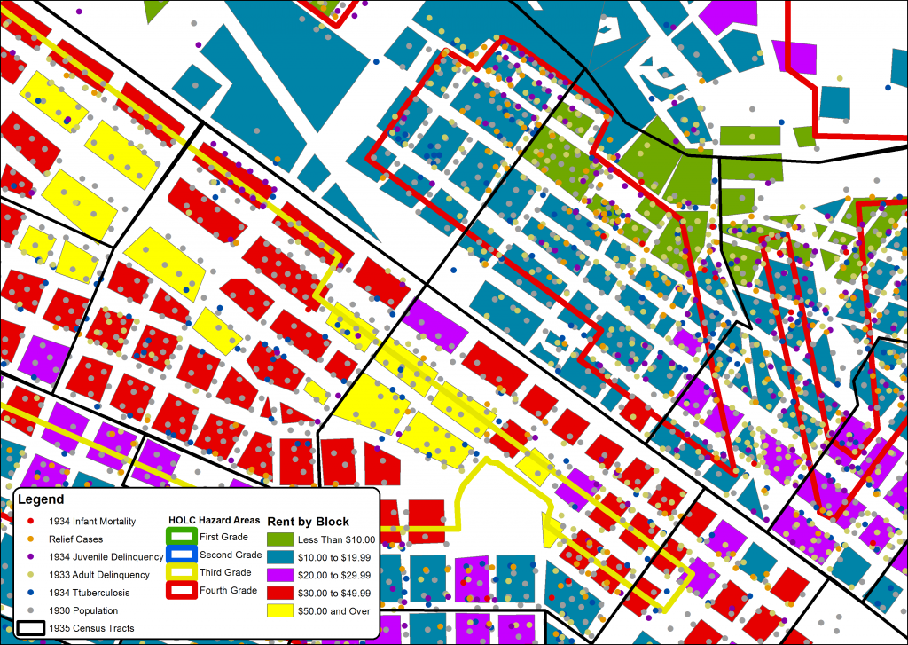
GIS map showing overlay from RPC report and HOLC hazard areas
Article edited to make corrections to errors pointed out by Mr. Cloud in the comments section.
