Teasing the Blogosphere
Describing visual work in a blog without being able to reveal the images is more than challenging: it’s boring. After we discussed this issue in our most recent Praxis meeting, the group suggested I post a Prism striptease. Linked below is a teasingly cropped and subtly altered image of the logo we decided on last week.
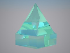
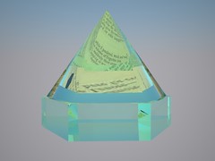
The other images show some renders of a 3D model I created to use as inspiration for the site’s color palette. The model is of a “deck prism” which was used to filter light from above the deck of a ship into the cabins below. The refracted colors that emerge when light passes through the prism can be seen in online images, but the digital model offered a lot more control.
http://www.flickr.com/photos/28122639@N05/6761716871/
The above video shows the visual options offered by the model of the deck prism.
While the deck prism is recognizable as an object, its clarity and sharp lines make it a good source of abstract imagery for the site. The model also allowed me to experiment with reflections of the texts we chose as our three highlighting samples. The text was simply applied to a plane directly below the prism in the 3D scene, and the reflections changed on the fly based on the camera position. You can see part of the first line from “The Raven” reflected in one of the images below.
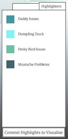
Finally, the last image shows the highlighter “palette” that we used for our wireframe. The boxes are mostly just placeholders, but the colors represent some of the options that came out of the deck prism, and I think the categories we chose for Edgar Allan Poe’’s “The Raven” could elicit a thought provoking response from a crowd.


