The Direction of Prism
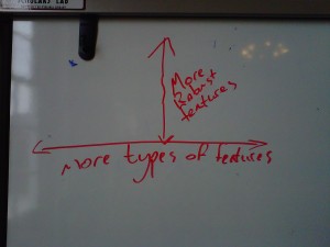
This week, the team has been throwing around a number of ideas as to how we can further develop Prism. I keep falling back on spatial metaphors to categorize the changes currently in play. I threw the following model onto the SLab white board, wherein I propose two types of changes: vertical and horizontal.
First, the vertical axis, those changes which work within the tool’s existing functionality. Some changes deepen a function already in place. The suggestions offered by last year’s team for other visualizations would fall into this category. A new visualization can offer a more dynamic interaction with a set of markings, but users are still engaging with the same dataset. The fundamental function of the tool would remain the same. These sorts of vertical changes offer a deeper, more robust mode of interaction with the operations that the tool can already carry out.
I oppose these to horizontal changes, which more fundamentally alter the number and types of things that a tool can do. We have talked a lot about carrying Prism into other media: music, images, and video. We have also talked about freeing up the controls on Prism, making it possible for users to upload their own texts or to hide the categories prior to marking. These sorts of modifications change the face of Prism more drastically, resulting in different data sets and new possibilities for the users.
These horizontal changes seem to carry the highest risk. As we discussed at our meeting last week, we risk diluting Prism’s identity if we try to add in too many features: a tool that can do anything might just be a tool that can do nothing effectively. The SLab crew also pointed out how some of our broadening changes might carry us into territory that has already been covered by other developers and other tools. At the same time, though, some of suggestions for horizontal growth are incredibly exciting. Taking Prism into other media, freeing up the controls – these changes could help Prism reach a broader audience by teaching it new tricks. I think we should take them seriously.
Of course, this horizontal/vertical distinction does not quite hold up under close scrutiny. I think it would be a mistake to think of depth-oriented changes as being somehow narrower than broader changes. A new visualization could fundamentally alter your relation to the data in such a way that it feels as though the functionality has altered entirely. No modification slots entirely into one or the other category, and the spatial metaphors might muddy the waters unnecessarily. All the same, I find the distinction helpful for mapping out the morphing shape of the Prism of the future.
So do we build depth, or do we broaden our base? Do we dig into the features already present, or do we add new ones? At what point does Prism cease to be Prism? What would Prism look like if we graphed it?

