What’s in a name?
The week before spring break Zach and I pitched two different design strategies for Ivanhoe. [See Zach’s post on a Medieval-themed design.] As part of the pitch we each designed an informational website that we could apply to the game, but I also was trying to convince our team that we should change our name. Why? Well, even though Ivanhoe has positive associations with an existing community, I felt that the name did not convey how our game is designed to function. Also, by changing our name we were engaging in a meta-learning experience - essentially playing Ivanhoe with the name Ivanhoe! By giving Ivanhoe a new name I did not want us to abandon the old, but rather taking the original spirit of Ivanhoe, make new connections and create something new. _ _
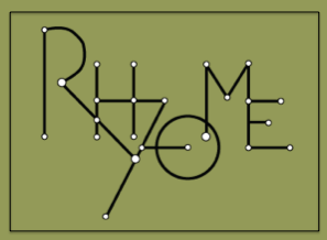
The design team came up with the name “Rhyzome” as a play on the word Rhizome - a biological term used to describe types of vegetation connected by a series of tubes. The Rhyzome logo (see above) was designed around this same logic - the nodes in the logo symbolize connections users make during the game and the two sizes of circles represent first and second level moves. Green shows the connection between our game and the hard sciences, conveying our goal of cross-discplinary application.
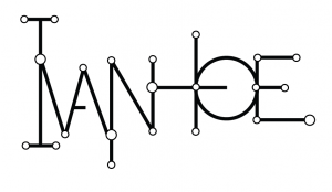
After my pitch our team agreed that Rhyzome was not the best alternative. While the name better conveys what Ivanhoe does, Rhyzome is already associated with an existing community and journal in the digital humanities. So, we decided that what is best for the team is to stay with the name that evokes recognizability within the DH community but apply the Rhyzome aesthetic to our logo/game design. Below is a first iteration of a logo that combines the two ideas. As you can see there are still incorporating two circle sizes to represent different levels of connections as well as connecting all the letters to represent a network of ideas. This logo also leaves lines open inside the A and the O to represent the possibility for new connections as the game progresses. Question to our readers - is this logo legible? Thoughts on this design? Would really love feedback as I continue to modify it.
While my “pitch” for a new name was unsuccessful, in the end it was a win for our team. We now have a great design strategy that matches the theoretical logic of Ivanhoe!


