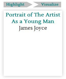
Who says I like right angles?
Last week, I started tackling what I naively assume to be some CSS issues that “real” web designers might also see as challenges. The “box model” in CSS allows for lots of “clean” designs, but it discriminates against non-quadrilateral polygons, and against angles other than 90 degrees, for that matter. When a prism is a guiding concept and image for your design, you probably don’t just want a bunch of rectangles, and accordingly, Ed’s designs for the Prism site involve a big “prism” in the background and a number of boxes and links that invoke the prism shape with their borderlines. So, with Ani DiFranco’s voice in my head, I asked the internet what to do. A few online sources for web design advice suggested creating angles and arrow shapes with empty divs with thick borders and no width and height, so I gave that a try today. It seemed strange when I first looked at it, but it turned out to be simple enough.

In what appears above, I tinkered with the border size of two empty spans (I used spans instead of divs since they happen to fall inside of list items on this page) until they lined up with the borders on the “highlight” and “visualize” links. I assigned each span a class and styled them like this:
.arrow-right {
float: left;
width: 0;
height: 0;
border-top: 11px solid transparent;
border-bottom: 11px solid transparent;
border-left: 22px solid #C0C0C0;
}

arrow-inset {
float: left;
width: 0;
height: 0;
border-top: 11px solid #C0C0C0;
border-bottom: 11px solid #C0C0C0;
border-left: 22px solid transparent;
}
Of course, there are a few big limitations here. For one, these spans have such a precise, absolute size that resizing the browser window even the slightest bit will reveal how messy of a solution this really is. And as Jeremy pointed out, the link ends at the edge of its rectangular container, so clicking in the “arrow” that seems attached to it won’t take you anywhere. To solve these problems, Jeremy suggested that I create a background image of an angle for each of the links. It will be a scalable part of the link rather than an object next to it, so the design will look better in different window-sizes and the interface will be more logical and easier to use. Figuring this out will also help me as I work on the large prism shape at the top of the page since it will also need an absolute position behind other elements.
I’ve also been working on gradients in CSS, specifically on how best to layer gradients to produce the effects in Ed’s header design. More on the header next time.
