
Designing a Data Physicalization: A love letter to dot grid paper
Claudia Berger is our Virtual Artist-in-Residence 2024-2025; register for their April 15th virtual talk and a local viewing of their data quilt in the Scholars’ Lab Common Room!
This year I am the Scholars’ Lab’s Virtual Artist-in-Residence, and I’m working on a data quilt about the Appalachian Trail. I spent most of last semester doing the background research for the quilt and this semester I get to actually start working on the quilt itself! Was this the best division of the project, maybe not. But it is what I could do, and I am doing everything I can to get my quilt to the Lab by the event in April. I do work best with a deadline, so let’s see how it goes. I will be documenting the major steps in this project here on the blog.
Data or Design first?
This is often my biggest question, where do I even start? I can’t start the design until I know what data I have. But I also don’t know how much data I need until I do the design. It is really easy to get trapped in this stage, which may be why I didn’t start actively working on this part of the project until January. It can be daunting.
N.B. For some making projects this may not apply because the project might be about a particular dataset or a particular design. I started with a question though, and needed to figure out both.
However, like many things in life, it is a false binary. You don’t have to fully get one settled before tackling the other, go figure. I came up with a design concept, a quilt made up of nine equally sized blocks in a 3x3 grid. Then I just needed to find enough data to go into nine visualizations. I made a list of the major themes I was drawn to in my research and went about finding some data that could fall into these categories.

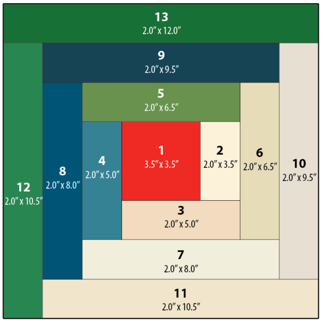
What my initial planning looks like.
But what about the narrative?
So I got some data. It wasn’t necessarily nine datasets for each of the quilt blocks but it was enough to get started. I figured I could get started on the design and then see how much more I needed, especially since some of my themes were hard to quantify in data. But as I started thinking about the layout of the quilt itself I realized I didn’t know how I wanted people to “read” the quilt.
Would it be left to right and top down like how we read text (in English)?

Or in a more boustrophedon style, like how a river flows in a continuous line?

Or should I make it so it can be read in any order and so the narrative makes sense with all of its surrounding blocks? But that would make it hard to have a companion zine that was similarly free-flowing.
So instead, I started to think more about quilts and ways narrative could lend itself to some traditional layouts. I played with the idea of making a large log cabin quilt. Log cabin patterns create a sort of spiral, they are built starting with the center with pieces added to the outside. This is a pattern I’ve used in knitting and sewing before, but not in data physicalizations.
A template for making a log cabin quilt block by Nido Quilters
What I liked most about this idea is it has a set starting point in the center, and as the blocks continue around the spiral they get larger. Narratively this let me start with a simpler “seed” of the topic and keep expanding to more nuanced visualizations that needed more space to be fully realized. The narrative gets to build in a more natural way.

So while I had spent time fretting about starting with either data/the design of the visualizations, what I really needed to think through first was what is the story I am trying to tell? And how can I make the affordances of quilt design work with my narrative goals?
I make data physicalizations because it prioritizes narrative and interpretation more than the “truth” of the data, and I had lost that as I got bogged down in the details. For me, narrative is first. And I use the data and the design to support the narrative.
Time to sketch it out
This is my absolute favorite part of the whole process. I get to play with dot grid paper and all my markers, what’s not to love? Granted, I am a stationery addict at heart. So I really do look for any excuse to use all of the fun materials I have. But this is the step where I feel like I get to “play” the most. While I love sewing, once I get there I already have the design pretty settled. I am mostly following my own instructions. This is where I get to make decisions and be creative with how I approach the visualizations.
(I really find dot grid paper to be the best material to use at this stage. It gives you a structure to work with that ensures things are even, but it isn’t as dominating on a page as a full grid paper. Of course, this is just my opinion, and I love nothing more than doodling geometric patterns on dot grid paper. But using it really helps me translate dimensions to fabric and I can do my “measuring” here. For this project I am envisioning a 3 square foot quilt. The inner block. Block 1, is 12 x 12 inches, so each grid represents 3 inches.)
There is no one set way with how to approach this, this is just a documentation of how I like to do it. If this doesn’t resonate with how you like to think about your projects that is fine! Do it your own way. But I design the way I write, which is to say extremely linearly. I am not someone who can write by jumping around a document. I like to know the flow so I start in the beginning and work my way to the end.
Ultimately, for quilt design, my process looks like this:
- Pick the block I am working on
- Pick which of the data I have gathered is a good fit for the topic
- Think about what is the most interesting part of the data, if I could only say one thing what would that be?
- Are there any quilting techniques that would lend itself to the nature of the data or the topic? For example: applique, English Paper Piecing, half square triangles, or traditional quilt block designs, etc.
- Once I have the primary point designed, are there other parts of the data that work well narratively? And is there a design way to layer it?
For example, this block on the demographics of people who complete thru-hikes of the trail using annual surveys since 2016. (Since they didn’t do the survey 2020 - and it was the center of the grid - I made that one an average of all of the reported years using a different color to differentiate it.)
I used the idea of the nine-patch block as my starting point, although I adapted it to be a base grid of 16 (4x4) patches to better fit with the dimensions of the visualization. I used the nine-patch idea to show the percentage of the gender (white being men and green being all other answers - such as women, nonbinary, etc). If it was a 50-50 split, 8 of the patches in each grid should be white, but that is never the case. I liked using the grid because it is easy to count the patches in each one, and by trying to make symmetrical or repetitive designs it is more obvious where it isn’t balanced.

But I also wanted to include the data on the reported race of thru-hikers. The challenge here is that it is a completely different scale. While the gender split on average is 60-40, the average percentage of non-white hikers is 6.26%. In order to not confuse the two, I decided to use a different technique to display the data, relying on stitching instead of fabric. I felt this let me use two different scales at the same time, that are related but different. I could still play with the grid to make it easy to count, and used one full line of stitching to represent 1%. Then I could easily round the data to the nearest .25% using the grid as a guide. So the more lines in each section, the more non-white thru-hikers there were.
My last step, once I have completed a draft of the design, is to ask myself, “is this too chart-y?” It is really hard sometimes to avoid the temptation to essentially make a bar chart in fabric, so I like to challenge myself to see if there is a way I can move away from more traditional chart styles. Now, one of my blocks is essentially a bar chart, but since it was the only one and it really successfully highlighted the point I was making I decided to keep it.
 These are not the final colors that I will be using. They will probably all be changed once I dye the fabric and know what I am working with.
Next steps
Now, the design isn’t final. Choosing colors is a big part of the look of the quilt, so my next step is dyeing my fabric! I am hoping to have a blogpost about the process of dyeing raw silk with plant-based dyes by the end of February. (I need deadlines, this will force me to get that done…) Once I have all of those colors I can return to the design and decide which colors will go where. More on that later. In the meantime let me know if you have any questions about this process! Happy to do a follow-up post as needed.