A First Look
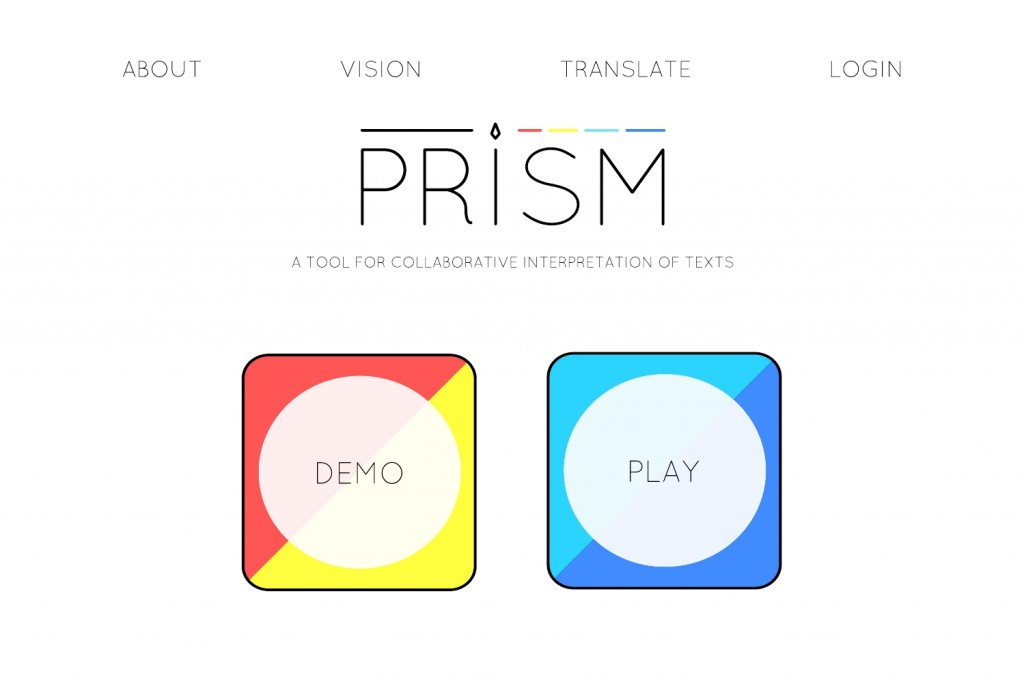
On Friday, the design team made a few mock-ups of what we’d like Prism to look like. We started with some of the basic pages that the next version of prism will probably have, a homepage, a login pop-up, etc.
I feel that I have a much clearer idea of what needs to be done now that I’ve seen where we hope to take the site refresh. I’ve also noticed that the design team is making a number of important decisions as we go. For example, while designing the homepage mock-up we found ourselves asking questions about when and where people will be asked to login. Because we’re making these decisions on the fly and we’re not all working on the same things, I hope that others will have a chance to respond and revise. I also hope that these mock-ups will help the team figure out where to focus our energy in the weeks to come.
Here’s how we imagine the site might work. The Homepage will have two large buttons, something like DEMO and PLAY.
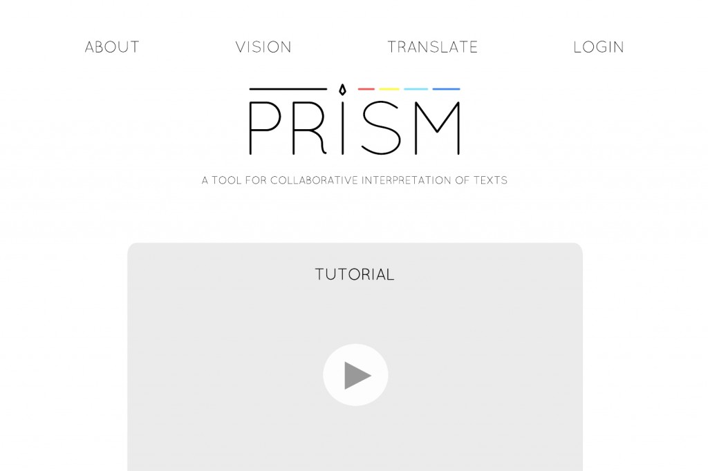
The DEMO button will hopefully lead to a tutorial page.
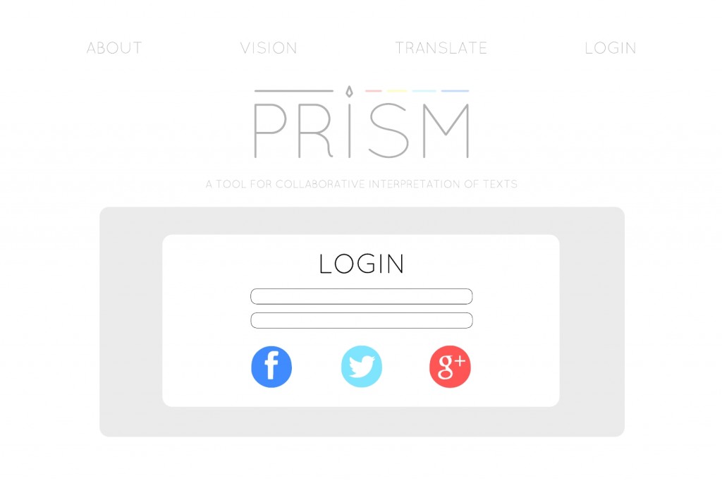
The PLAY button will lead to a pop-up window where users can login. Brandon is working on open authentication as we speak.
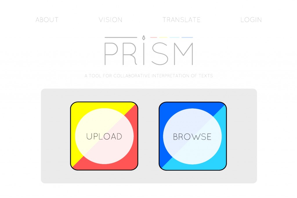
Once a user has logged in, she’ll have the choice to UPLOAD or BROWSE texts.
The UPLOAD button might lead to some simple interface like the one below.
Any thoughts? Revisions? Likes? Dislikes? I imagine Cecelia and I will start with the homepage over the next week, so it might be good to start our conversation there. The rest of this will certainly change as others on the team start to take on particular tasks.


