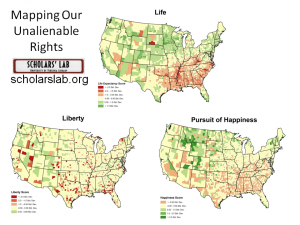
Mr. Jefferson ended his best-known sentence with “Life, Liberty and the pursuit of Happiness.” The only thing missing was maps.
In the Scholars’ Lab, we’re all about the spatial goodness. Inspired by Kansas State University’s Seven Deadly Sins maps, we set about converting the qualities of life, liberty, and the pursuit of happiness into quantities we could visualize through maps. Brainstorming commenced on how best to measure the unmeasurable. Mappiness ensued.
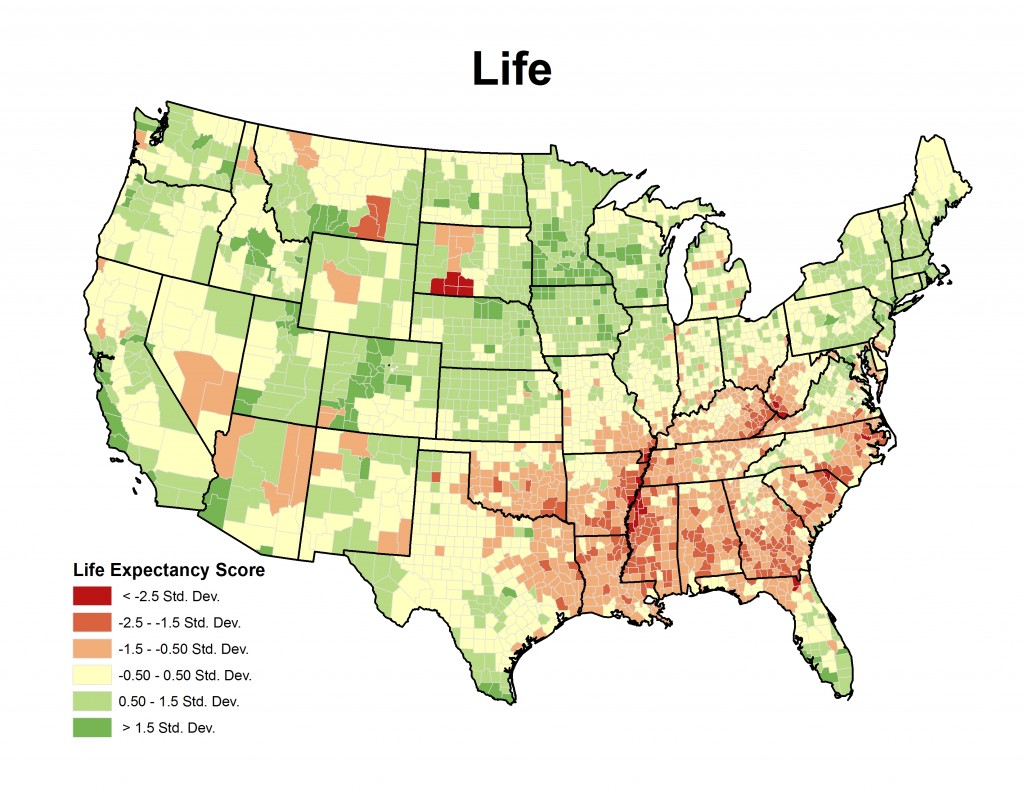
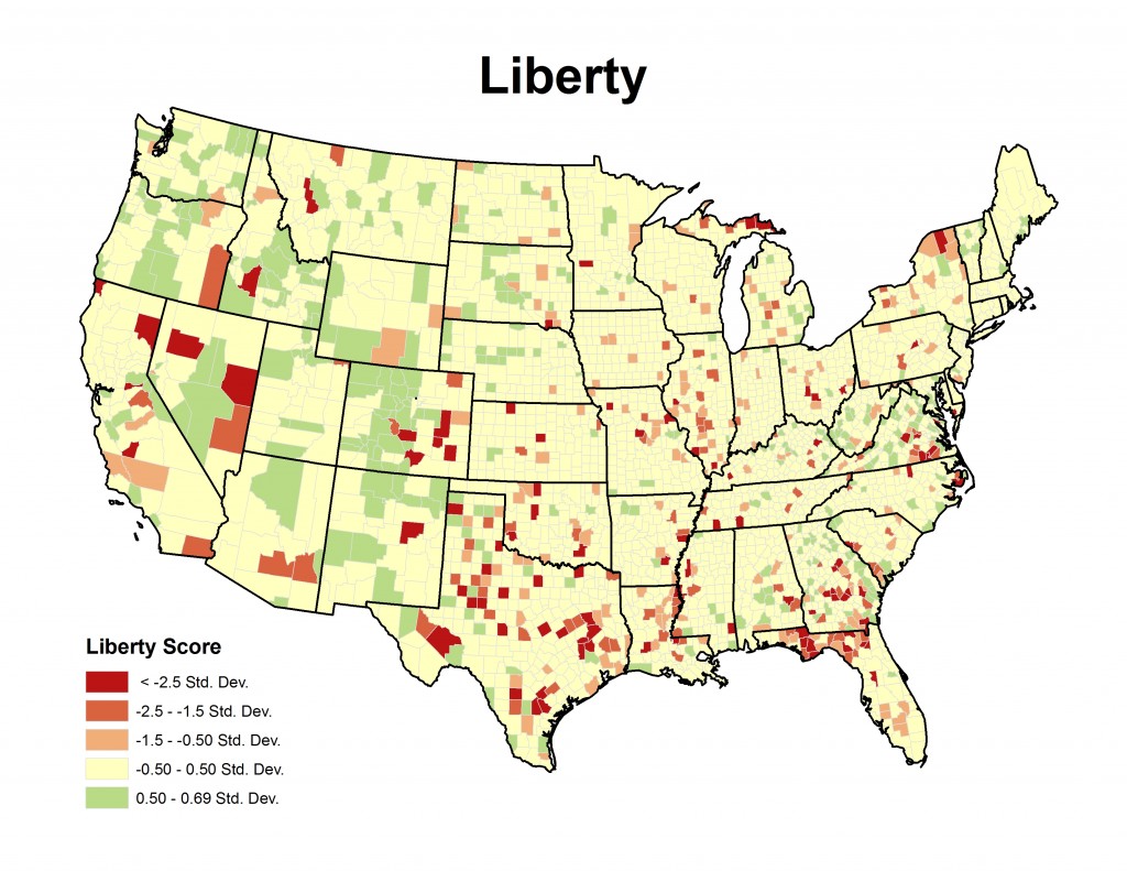
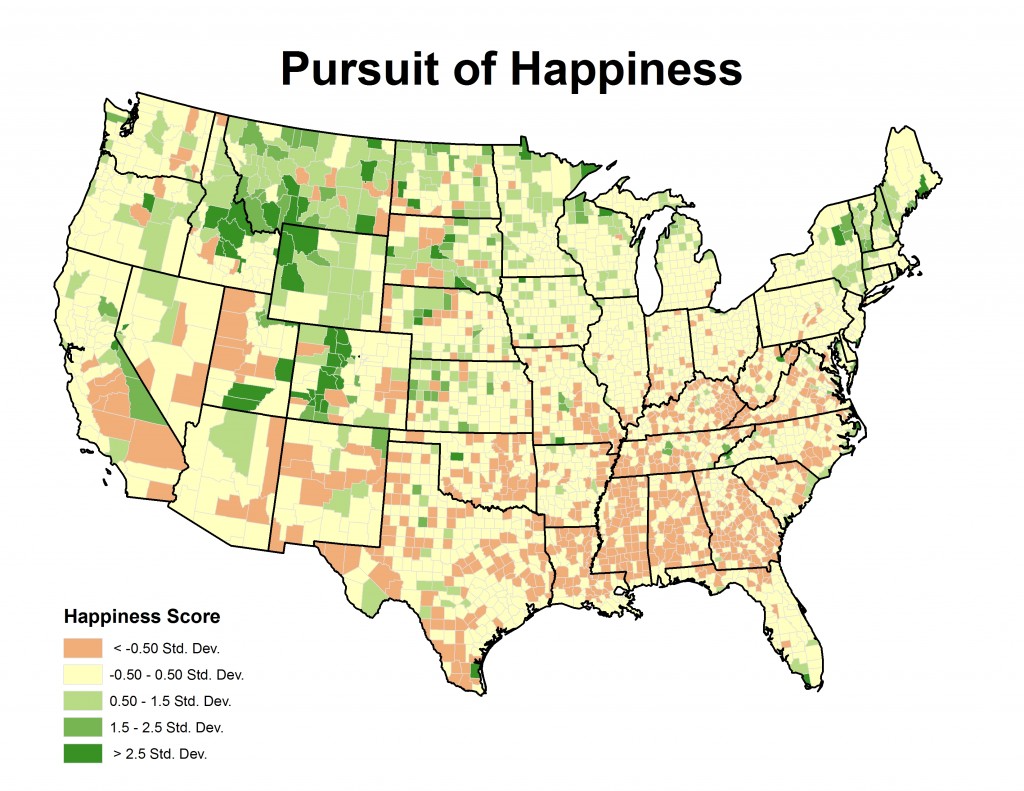
We calculated a score for Life, for Liberty, and for the Pursuit of Happiness for each county in the continental U.S. and mapped how each county’s score deviated from the mean. So our maps highlight extremes, both high and low.
Life mapped combined male and female Life Expectancy At Birth data for 1999.
Liberty mapped US Census datasets for 2000 to measure the institutionalized population as a percent of the total population.
Pursuit of Happiness mapped the ratio of arts, entertainment, and recreation establishments to the total population from the 2002 US Economic Census.
Transforming datasets from a spreadsheet to a map takes advantage of our human ability to consume mass quantities of information visually. Rows of numbers stashed away in academic journals and US Census tables come alive when mapped to show comparisons with their neighbors both near and far. Patterns and clusters appear. New questions are asked. New answers come. New maps emerge.
And here’s good news: If you find our measures of Mr. Jefferson’s famous phrase lacking, software tools to combine and manipulate datasets that may share only common geographic markers can now make cartographers of us all.
Happy mapping!


