
Mapping Alone, Together
For the past few weeks, I and my fellow Praxis Fellows have been developing teaching workshops as part of our pedagogy unit. Our theme for the year is “DH Education,” and so our workshops have taken on a special significance as we use them to start thinking about our Spring project and the shape it will eventually take.
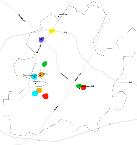
We were challenged to develop a teaching-learning experience for a DH method or technique that did not require any digital technology to execute. I chose to do my workshop on mapping and data visualization. The workshop will have attendees use pen or pencil to map frequently visited locations in the city of Charlottesville and how they feel when they inhabit those spots. I’ll provide attendees with a printout of a rough outline of the city to help orient them and ensure that everyone’s final products can be unique while still speaking to one another. Attendees will be asked to choose five to ten frequently visited spots in the city and use a fixed color-coding system to describe how being there makes them feel.
(In the spirit of transparency and generosity, here’s my own map:)
We’ll then come together and compare our maps with one another. We’ll begin with more obvious questions about maps’ appearances:
- What locations were unique to each person?
- What locations turned up over and over?
- Which feelings were most common across the board?
- Which feelings were least common?
- What kinds of things would we learn about Charlottesville if we were able to layer the maps on top of one another?
…and so on. Then we’ll move on to a more probing, meta analysis of the task of mapping itself and start asking questions like:
- What did you find easy about the activity? What did you find difficult about it?
- What, if anything, do you feel like you learned or gained as a result of the activity?
- What did you feel like you had to leave out or was lost?
- Did you choose to omit any information? If so, why? What, if anything, can you extrapolate about your fellow attendees’ lives just from looking at their maps?
- How do you think the task would change if you knew it would be shared with people outside this room?
- How do you think the project would change if we had 100 participants? 1000?
I’ll close the workshop with a brief presentation of how humanists have used digital mapping technology, in particular ArcGIS and OpenStreetMap, to present information that doesn’t necessarily fit under the heading of “empirical data.”
I chose to do my workshop on mapping for a number of reasons. The first is that I have a personal scholarly interest in space, how it changes people, and how people change it. I am especially interested in how to visually represent data about space that isn’t strictly quantitative—for instance, is a map able to capture the way we feel as we move through a city, and how those feelings change as we traverse different zones and neighborhoods? Because of this, I want my workshop to introduce participants to the broader possibilities of mapping and data visualization. We encounter maps all the time that attempt to succinctly convey new information by displaying it on top of fixed spatial representations: the borders of a nation, for instance, or the grid of a city street system. That information is itself usually presented as “hard,” empirical data. But underneath graphic representations of things like zoning patterns and air pollution levels and travel routes are a mesh of lived, personal experiences, through which structural phenomena are often filtered and understood. I often refer back to musician Michelle Zauner’s essay about how, after her Korean immigrant mother passed away, being in H-Marts make her cry. The deeply personal—Zauner’s loss, her private trips to the grocery, her relationship to Korean food—magnify the structural—the social and sociological trends of diaspora, the dynamics of urban space and “ethnic shopping”—and vice versa, all within a single space: H-Mart.
Secondly, I want to initiate a conversation about what gets lost and what is gained between our personal experience of something—in this case, the city of Charlottesville—and our collective understanding of it. I had, for instance, initially toyed with the idea of having everyone draw their own map entirely from scratch with no reference to Charlottesville’s actual geography or orientation. It would be entirely a city of their own experience and invention. However, this would have made any systematic comparison of everyone’s maps much harder, if not impossible, and we would potentially lose a collective understanding of how our experiences interlace and overlap with one another.
The “collective experience” is something I’m always chasing after, both in my own work and in my perusal of other DH projects. Something that really appeals to me about digital mapping technologies is their ability to aggregate crowdsourced information and represent a multiplicity of stories and perspectives all at once. Projects like “We Shall Never Forget,” which displays the last movements of victims of the 3-11 Tsunami Disaster in Japan, overcome the often clinical form of the map to tell deeply moving stories of loss and memory.
These projects also raise difficult questions about privacy, intimacy, and labor. “We Shall Never Forget” was built collaboratively through interviews with victims’ families by a regional daily newspaper and a lab at Tokyo Metropolitan University. Nevertheless, there is still something almost invasive, even voyeuristic to me about it, like I am seeing something I shouldn’t. Other large-scale crowdsourced projects, like “Mapping Emotions in Victorian London,” use historical and/or literary data, thus providing some distance between the audience and the content. However, “Mapping Emotions” relies on labor from sources like Amazon’s Mechanical Turk to aggregate the information. Mechanical Turk is infamous for its low wages (as low as 1 cent per task) and reliance on poor, precarious workers. If time allows, I’d like the workshop to serve as a space to think through the problems of scale in aggregating and displaying information. Who is doing the work of data collection? Who is the “crowd” in crowdsource? What, and who, are we not seeing when we only look at the information on the map?
Pitfalls aside, however, I hope the workshop leaves attendees more enchanted than not about the possibilities of collaborative—or at least, collective—work. Something much more interesting should emerge from all of our maps being put together than when it’s just us filling in colored dots on our own. I am grateful that I was able to inject the same ethos into the workshop itself, incorporating the wonderful thoughts and suggestions my fellow Fellows shared during our sessions together. I hope the takeaway is that all collaboration must be mindful of disparities and work to remedy rather than exploit them, a DH value I greatly admire and wish was more widely held.